At this point in the story you’ve already read about the color of the year 2019 as Living Coral, but I thought it should be commented in our series of articles of Decorating with… so here it goes! After Ultra Violet color, the Pantone Institute has opted for the less controversial and happier Living Coral color (Pantone 16-1546). It is a very optimistic and full of life tone, found in nature but also in technological and digital world (have you seen the new Apple X?). That being said, it is a salmon color with a soft orange base that combines perfectly with rosewood! A part of me truly wanted pink, coral color looks good with a variety of colors. Here I show you a few combinations and how you can use it at home.
Neutral Colors
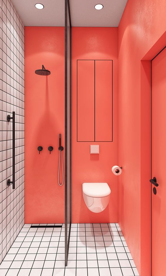
Being a very powerful color, combination with white, black, gray or mink cannot fail. It’s a “pop of color”, perfect elevation for a neutral interior. Using it in bathrooms and kitchens may seem very daring, but this is exactly why the impact is greater and more attractive. Who does not risk does not win!
 Coral paint on walls of a bathroom adds depth and joy.
 Coral in the kitchen to empower the space more than any other architectural element.
 In the kitchen again but this time used in furniture.
 A Coral colored sofa is always a good idea, combining with neutral colors through the rest of the furniture.
 Of course in the bedroom, it is very easy to add a couple of cushions or plaid on the bed.
 A cushion on coral Ombré in a super simple bedroom makes a difference.
Shades of Blue
Nature is an permament source of inspiration. If a combination of colors exist in nature, rest assured you will be fine. It is enough to see the photo below to understand what I’m talking about.
 The sky dyed pink tones illuminates a seascape, where we can find all shades of blue, from blue-gray to a stronger and darker blue.
 The combination with blue-gray is pretty soo, those two pastel colors are a match! As in landscape photo.


 We can risk a darker blue or blue oil, which are two strong colors but not the limelight removed.
 Simply ideal! I still see the picture of the inspirational seascape.
Yellow Mustard
Yes and yes to this combination. Coral and mustard are two colors of the moment and they love each other! Here are a couple of examples to show you that I’m not making it up.

 Betting for mustard and coral velvet upholstery, you’ll have a very chic space.
 What do you think of these chairs!

Light Pink and Golden
The best to the end, combining Living coral with all shades of pink (as seen in the photo above). Pink and gold is a very sophisticated combination, and if it includes a touch of coral and is a dreamy space.


 I cannot like this space more. I want to live in this restaurant!

 A little less daring combination (because of the neutral sofa) but the carpet in pink and gold with geometric patterns, combined with the coral wall is a winner.
What do you think the color of the year? It is one of your favorites or is it nah? Would you use it at home?
Thank you very much for reading and see you soon! (If you want to stay in touch, follow me on Instagram)
Fotos vía


